
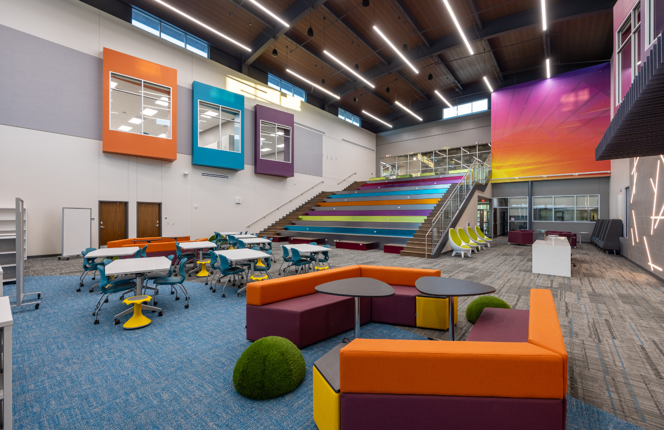
At Legacy Elementary School, the use of color was also a result of an extensive community engagement process. | Photo Credit: Bryce Powers, MOREgroup
By Evelyn Long
School playgrounds and indoor play spaces are increasingly expected to do more than support recreation. These environments now represent an opportunity to strengthen inclusion, emotional regulation and social development for students with diverse sensory needs. Among the design variables receiving more attention, color placement stands out as one of the most adaptable and underused tools.
For neurodivergent students, sensory processing can influence how they experience movement, social interaction and environmental stimulation. Strategic color use can reduce overwhelm, support transitions and encourage more confident play.
Why Color Matters in Neurodivergent Play Environments
Sensory experiences significantly affect neurodivergent students’ comfort and engagement in school settings. According to a 2022 population-based study supported by the Centers for Disease Control and Prevention, roughly 74% of autistic children who participated demonstrated documented sensory features, underscoring how environmental stimuli can shape day-to-day experiences. These differences may include heightened sensitivity to visual input, difficulty filtering distractions or a stronger need for predictable surroundings.
For example, autistic children may respond to colors differently based on how they perceive visual stimuli, with many experiencing colors more intensely than others. As for children with ADHD, bold colors may become distracting, and intense lighting can create discomfort for those with sensory sensitivities. Color can influence mood, behavior and learning in interior environments, so thoughtful selection is important when designing spaces for their needs.
Using Color to Create Predictable Zones
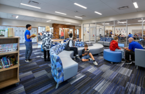
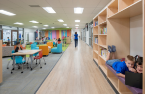
One of the most effective strategies involves assigning colors to different activity zones. Rather than applying bright shades evenly across an entire playground, designers can use distinct palettes to communicate function.
Colors such as red, orange and yellow are often associated with increased energy and positive emotions, while blue, green and purple tend to create a calmer, more soothing atmosphere.
Thus, different palettes may be more effective depending on the intended function of a space. Brighter, warmer shades are often better suited for active or social environments, whereas cooler tones may work best in areas designed to encourage rest, focus or emotional regulation.
A child moving from a stimulating activity to a calming area may recognize the transition through color changes before signage or adult prompts are necessary. Indoor sensory rooms often use this principle by visually separating active, tactile and calming areas through coordinated finishes and wall treatments.
At Our Lady of Confidence School — a Pennsylvania K-12 school serving students with intellectual disabilities and autism spectrum disorder (ASD) — Fun & Function created a hybrid sensory room intentionally designed to balance calming experiences with opportunities for movement and energy release. The planning process considered how visual elements and room organization would serve a wide age range without overwhelming students.
Surfacing as a Design Tool, Not Just a Safety Requirement
Playground surfacing often enters conversations through the lens of fall protection and Americans with Disabilities Act compliance. However, for neurodivergent-inclusive design, surfacing color can serve an additional behavioral purpose. Poured-in-place rubber systems may help visually define pathways, waiting areas or sensory-friendly zones.
A challenge for many project teams is that standard surfacing manufacturers often limit available palettes, making it difficult to align color placement with neurodivergent design goals. This becomes especially relevant when schools want to avoid visually chaotic environments while still maintaining playfulness.
An example worth noting is No Fault Surfaces’ color mixer resource, which allows designers to experiment with custom color surfacing materials for playgrounds rather than relying exclusively on standard presets. For schools seeking more precise control over visual environments, tools like this can support early-stage planning of quieter color gradients, transition zones or visually intuitive pathways without requiring major structural interventions.
Supporting Navigation Through Color Cues
Color placement can also reduce friction in how students navigate shared spaces. For neurodivergent children who struggle with transitions or executive functioning, visual cues embedded in flooring and equipment may reinforce movement patterns without relying heavily on verbal instruction.
Some schools and inclusive playground projects have experimented with colored ground markings to indicate movement sequences, waiting positions or social gathering areas. At specialist school Acorn Park School that serves students with ASD, KOMPAN redesigned the outdoor play environment to create clearer sensory organization and predictable activity zones.
Signage throughout each zone helps explain which equipment encourages high-energy movement and which is intended for calmer, sensory-supportive experiences. These visual guides also benefit caregivers and therapists who may be less familiar with the role different play activities have in sensory development.
Designing for Inclusion Through Intentional Color Choices
As school facilities evolve toward more inclusive models, color placement is moving from being an aesthetic afterthought to a strategic design decision. The strongest outcomes tend to emerge when color is tied to functions like guiding transitions, reinforcing predictability, softening sensory load and helping students better understand how to engage with a space. Whether through custom color surfacing materials for playgrounds, surfacing, zoning or navigation cues, smart color placement can make play feel more intuitive, accessible and meaningful for a broader range of learners.
Evelyn Long is a commercial interior design writer with specialized expertise in accessible, ADA-friendly spaces and designing environments that support mental health and inclusivity.